Brand decisions
How the identity was chosen
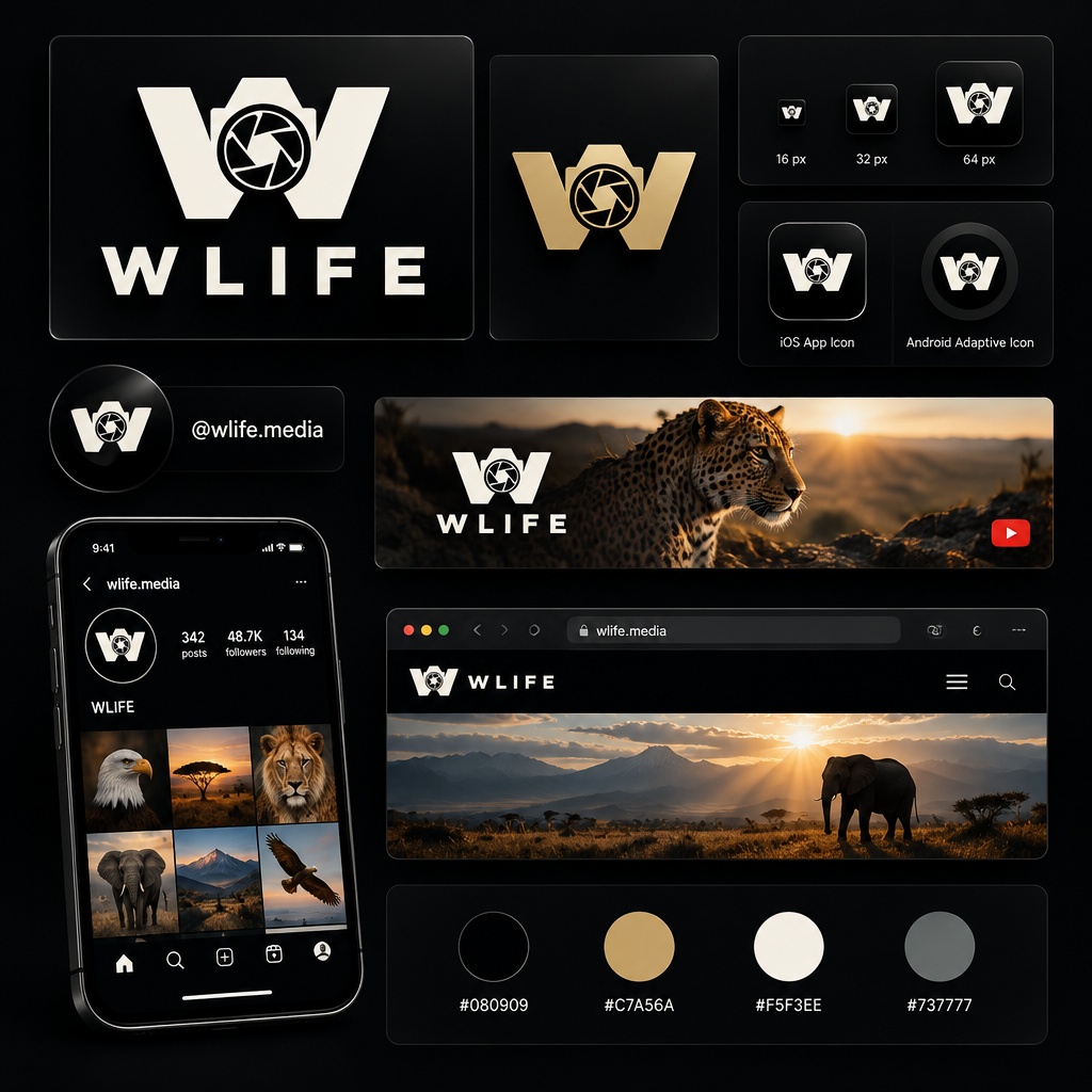
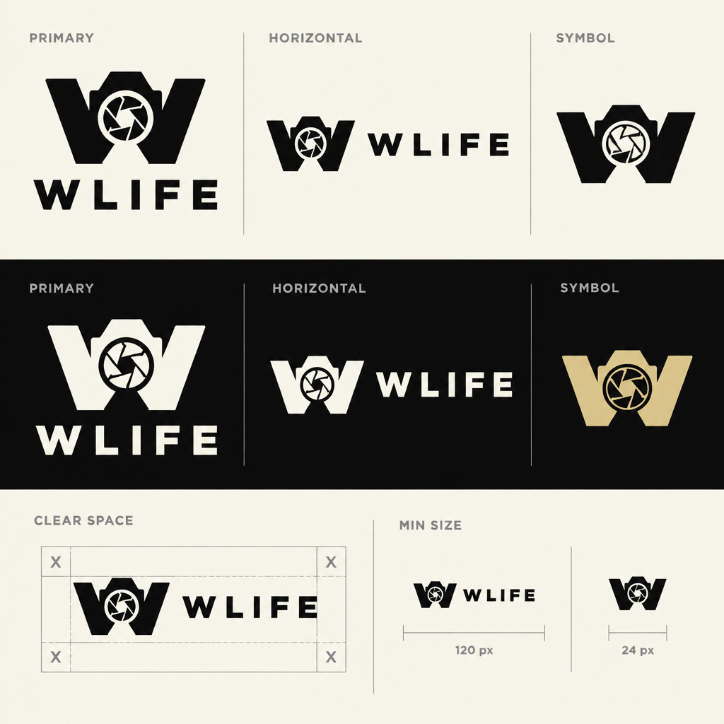
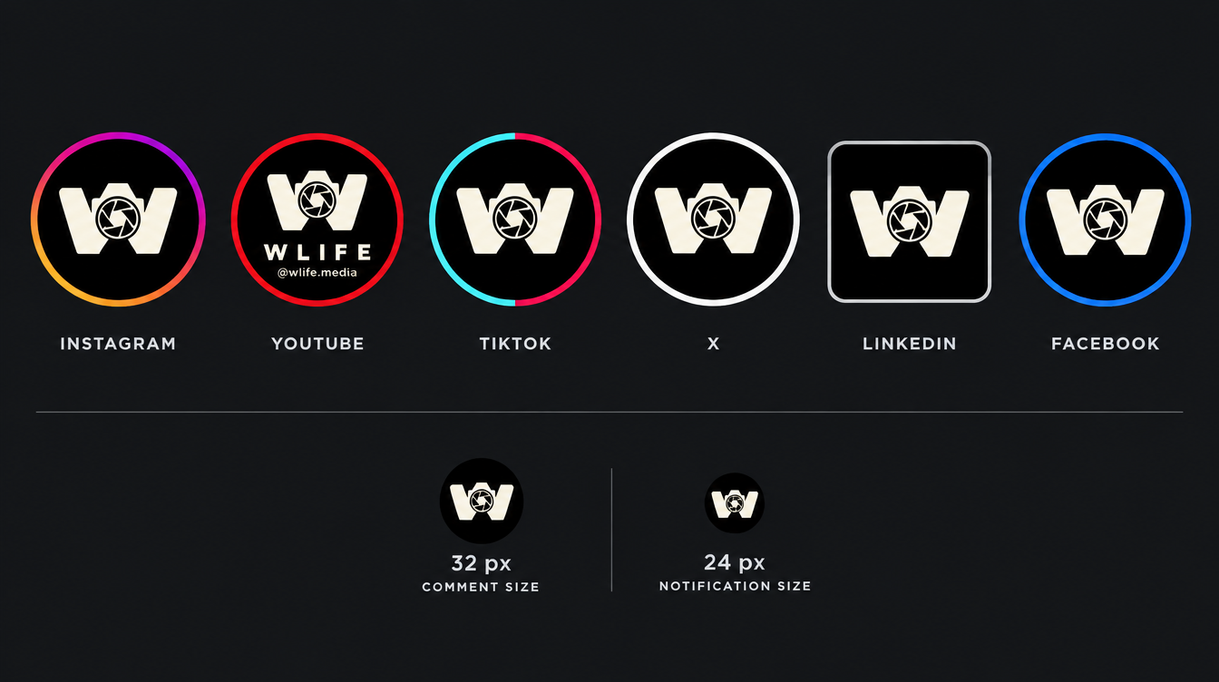
AI mock-ups kept as the record of the review. They are references, not production files: the production system is generated from vector geometry and design tokens. See the current system.
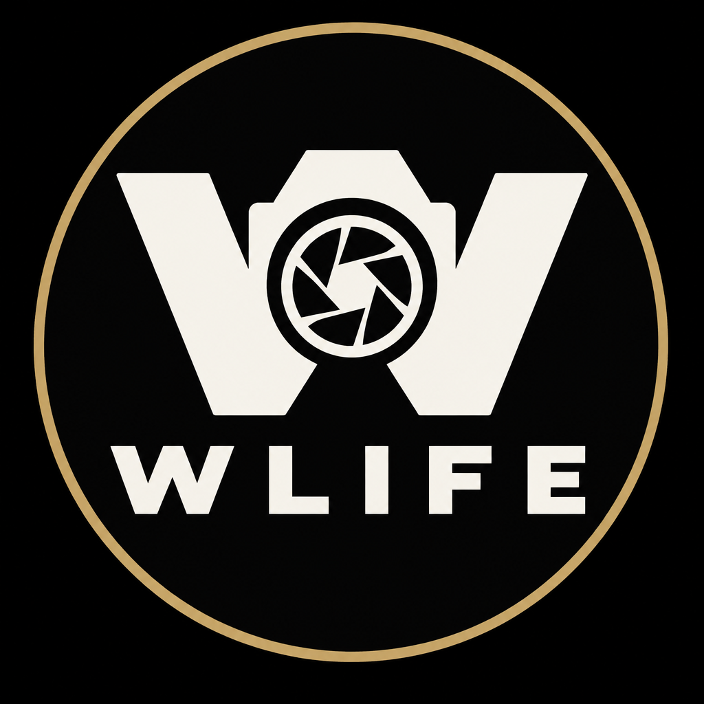
Approved symbol
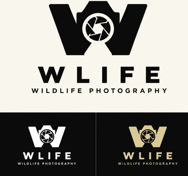
Camera W with a seven-blade aperture. The lockup is the symbol plus the word WLIFE, without tagline. The master renders in src/brand/masters were generated from the final reference, and the production vector (src/brand/emblem.json) is traced from them.
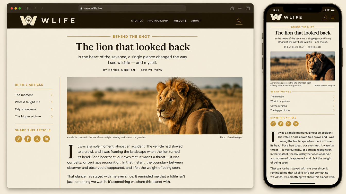
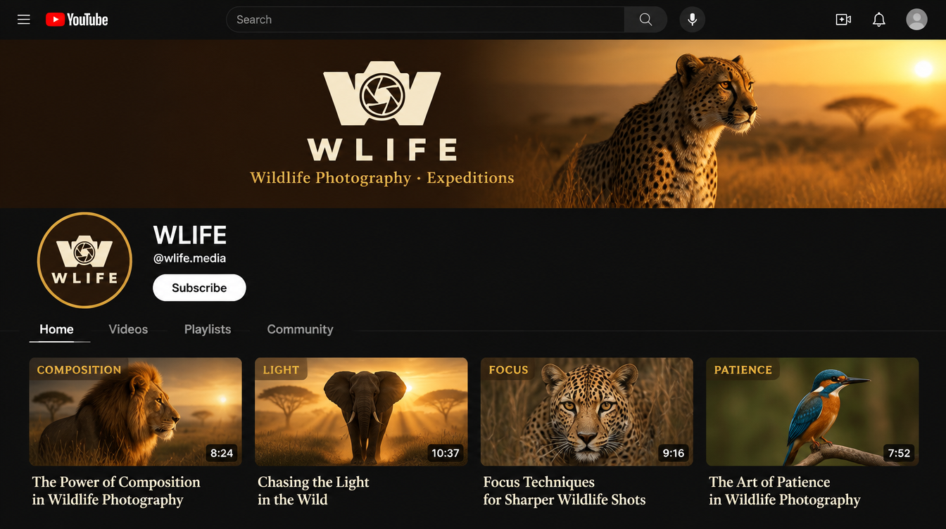
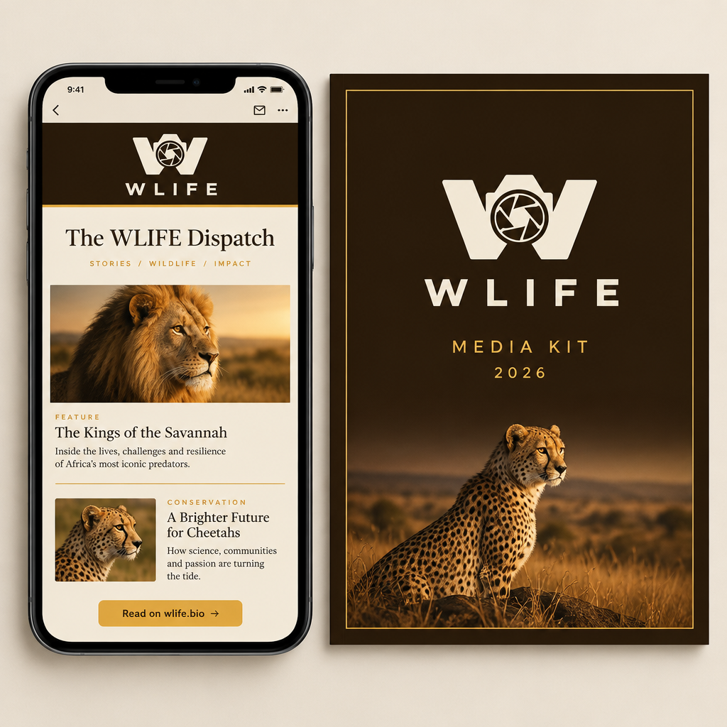
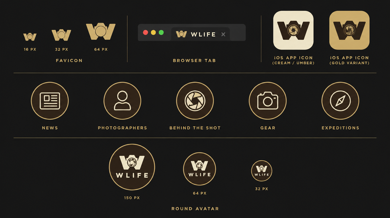
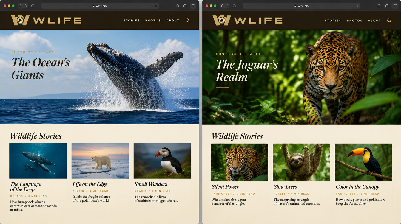
Savanna Gold touchpoints
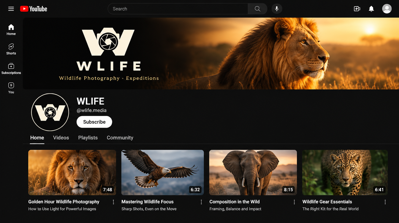
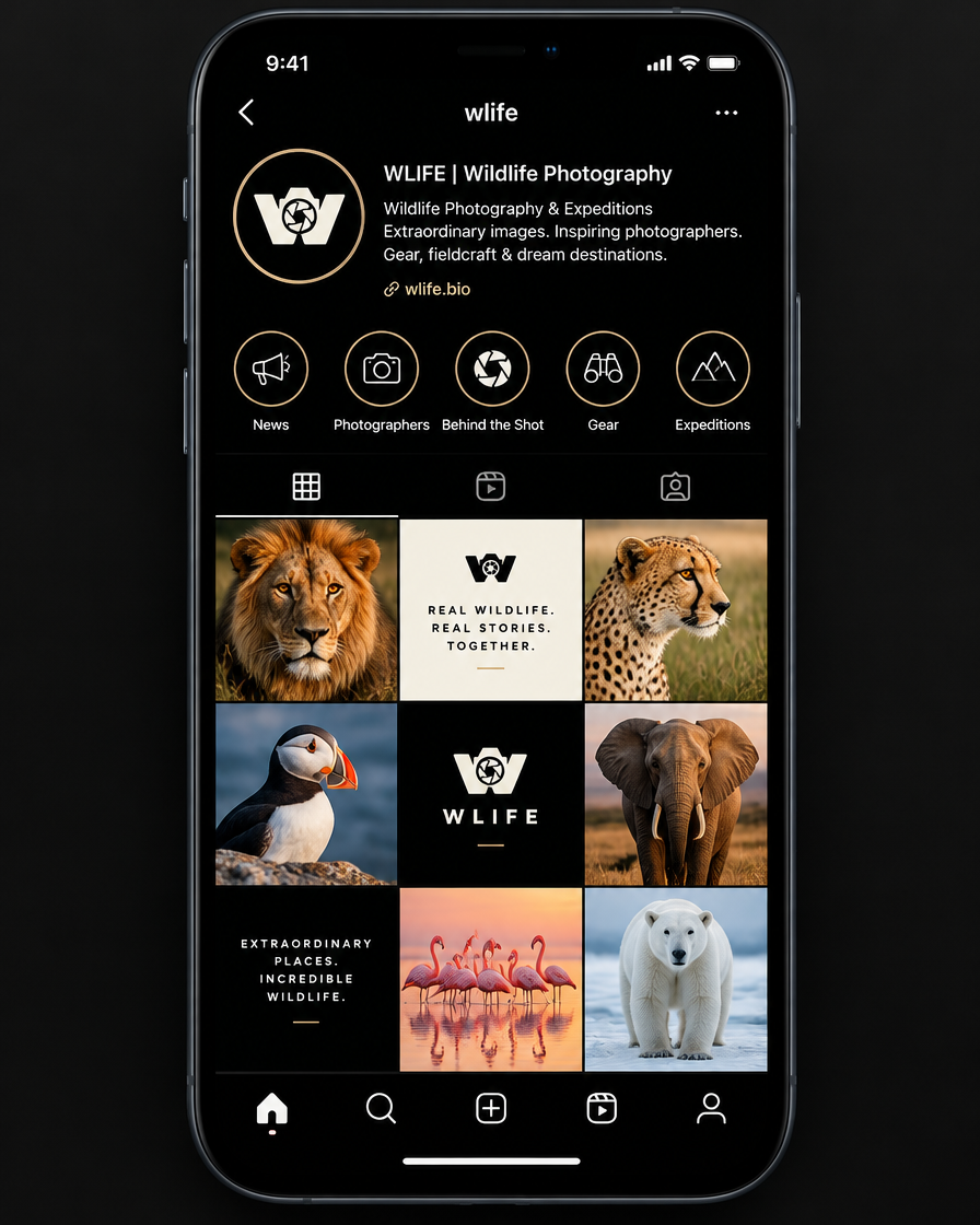
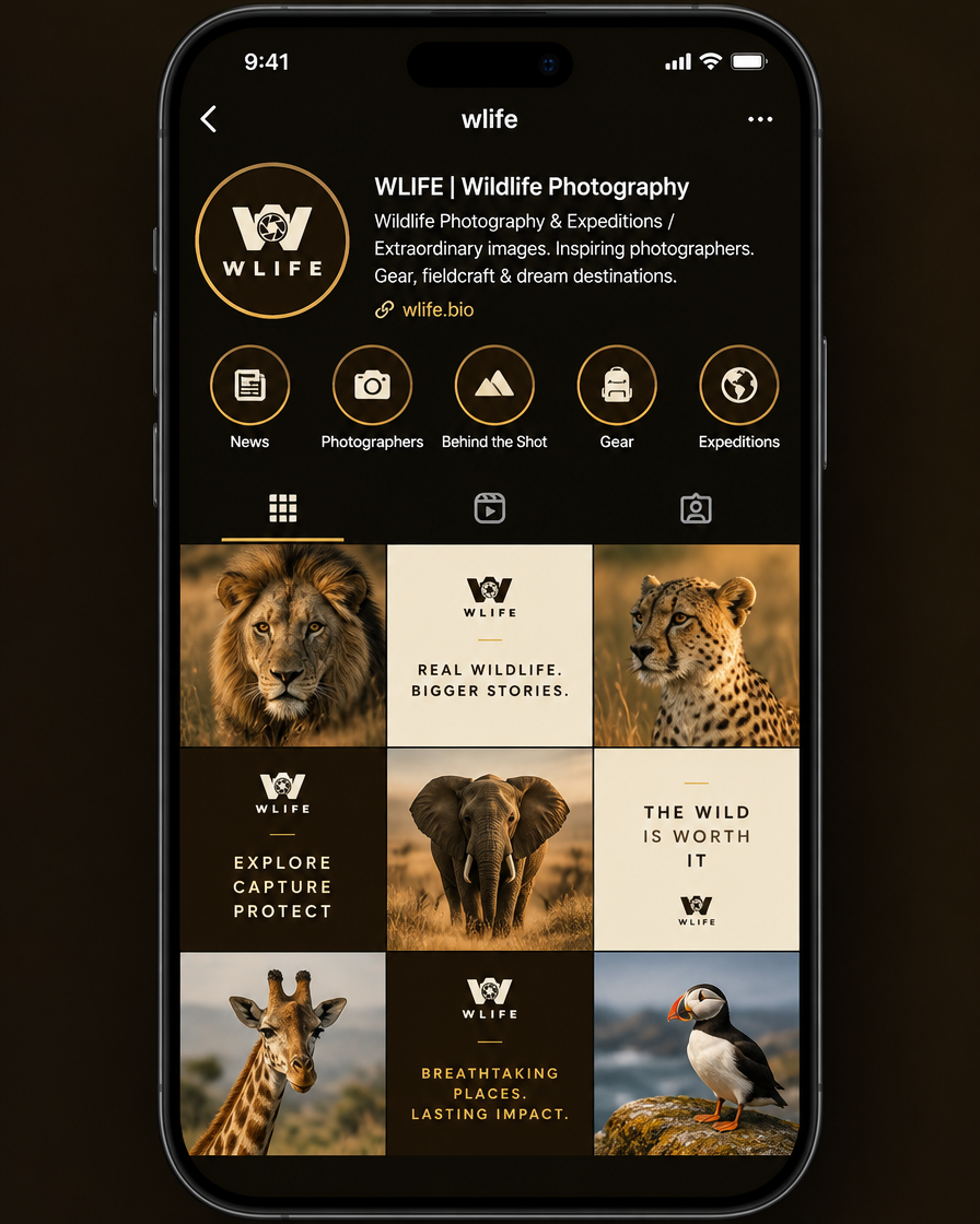
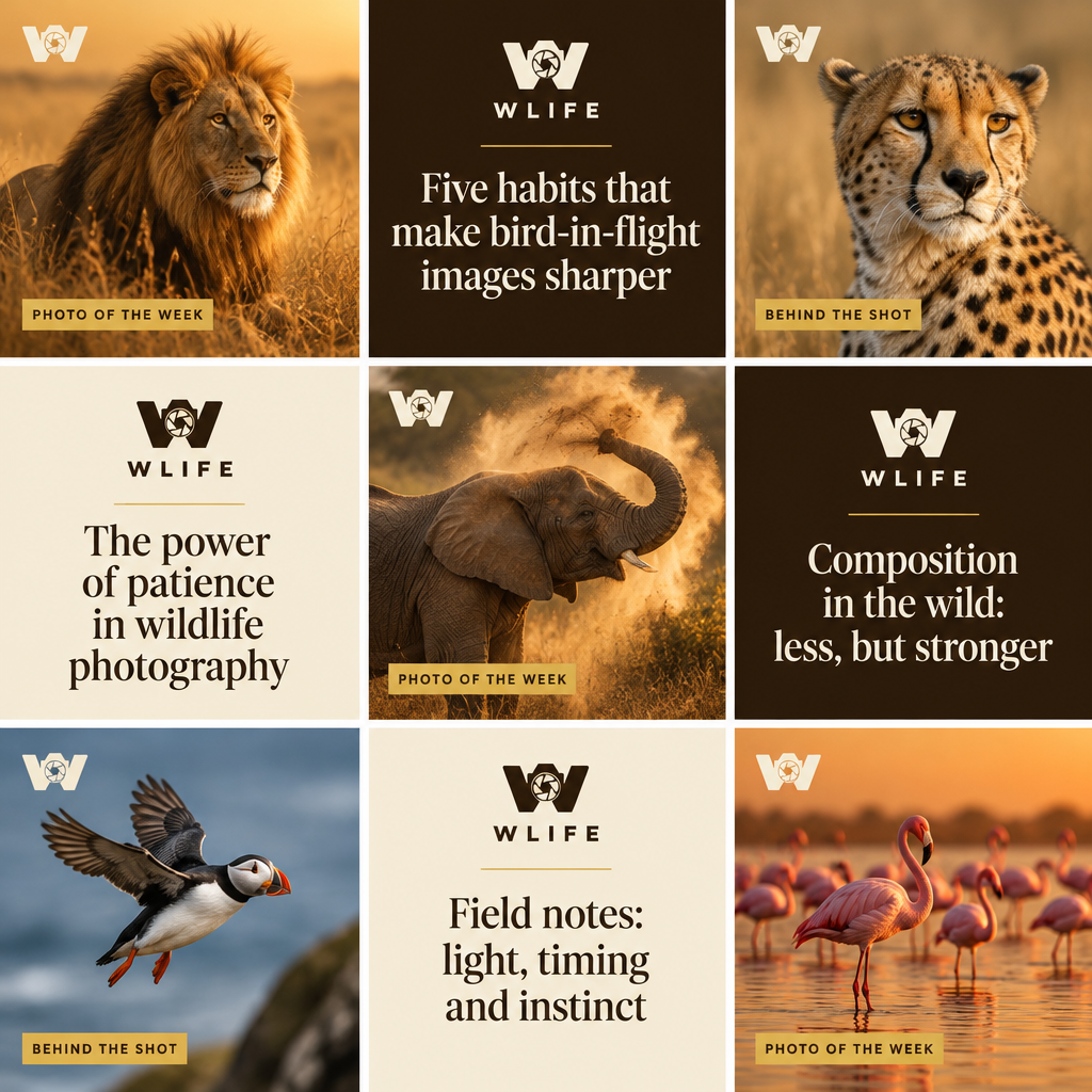
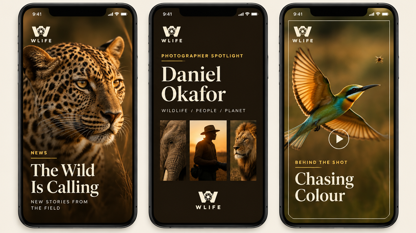
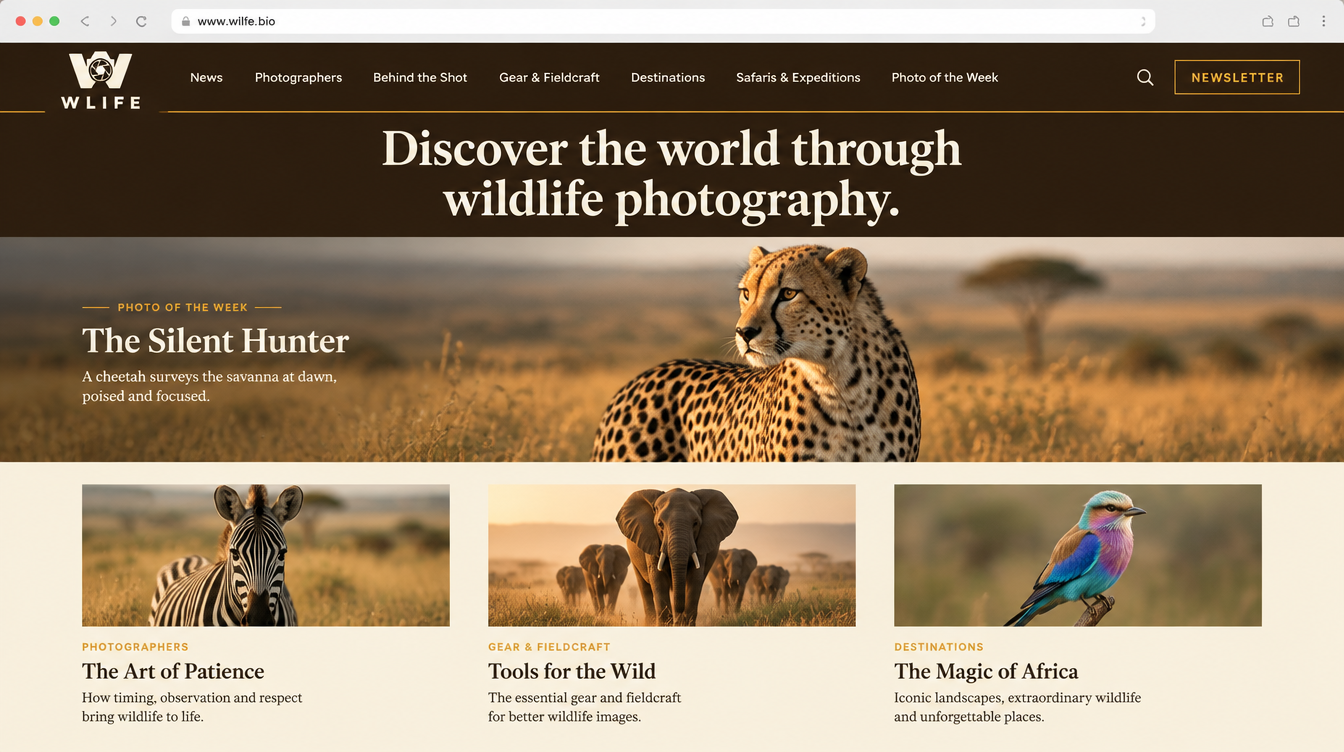
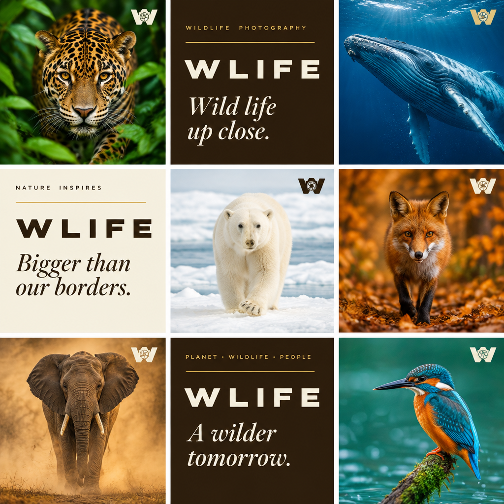
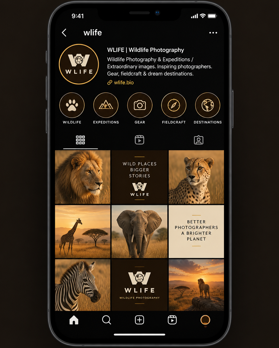
The chosen palette across Instagram, stories, the homepage, an article page, YouTube, newsletter and media kit, icons and highlights.
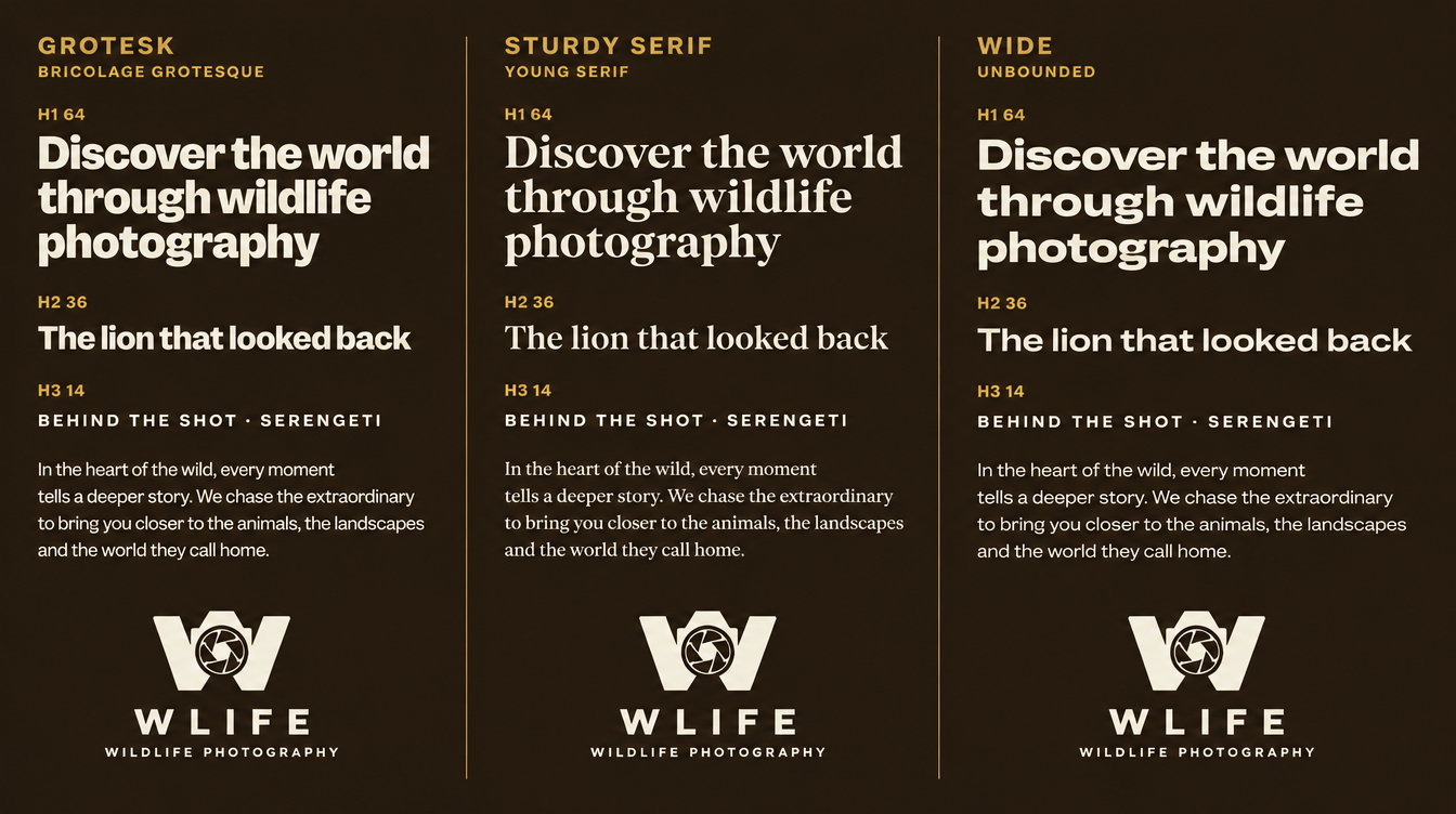
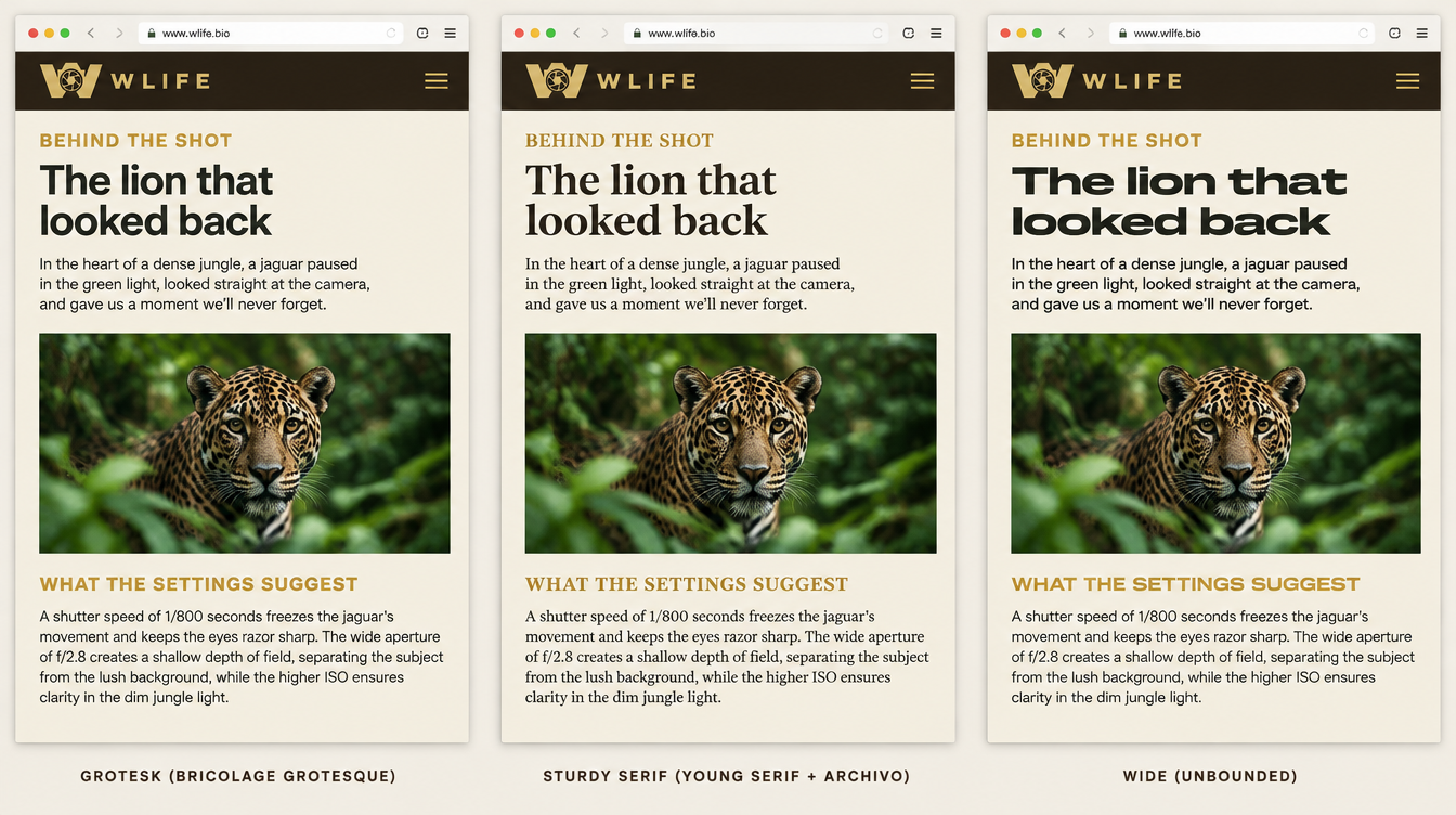
Typography: Unbounded, upright only
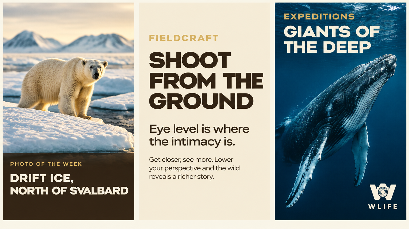
The wide system chosen for H1, H2 and H3, compared against two alternatives, and tested on photos of varied colour dominance.
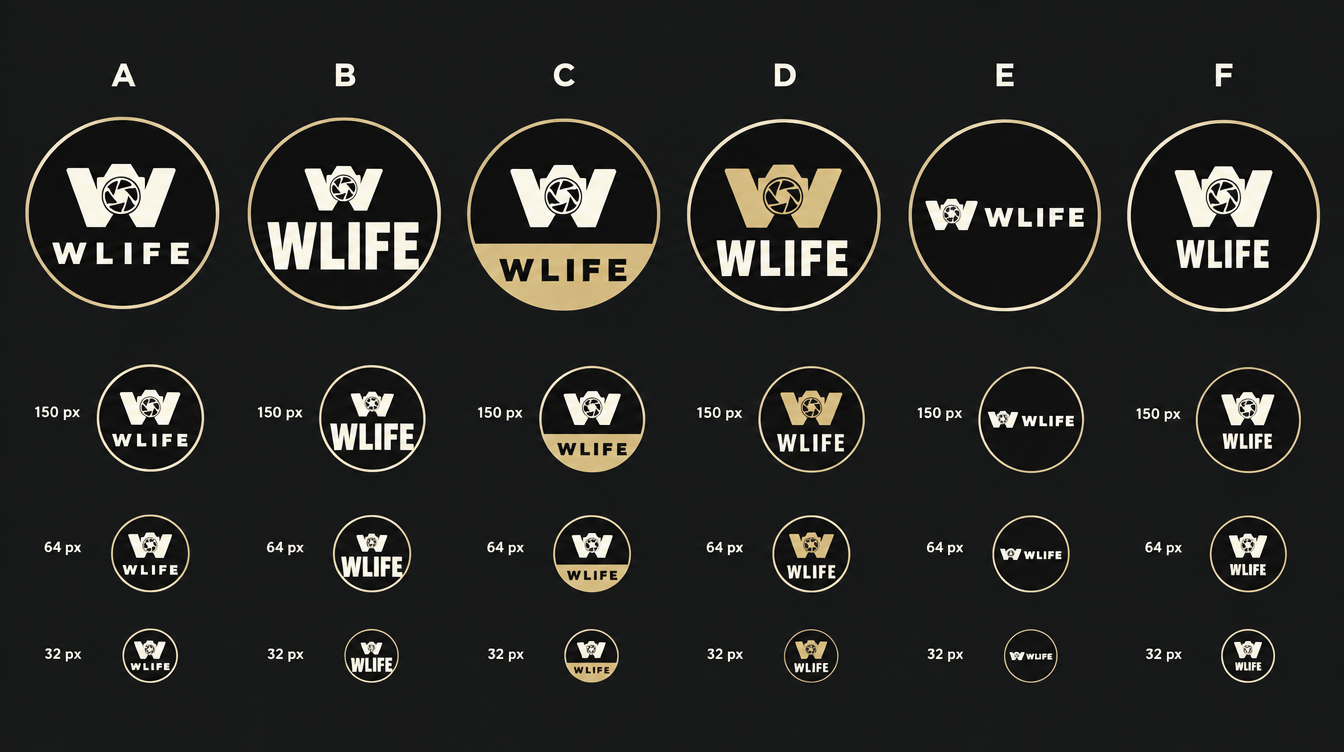
Avatar: arrangement A
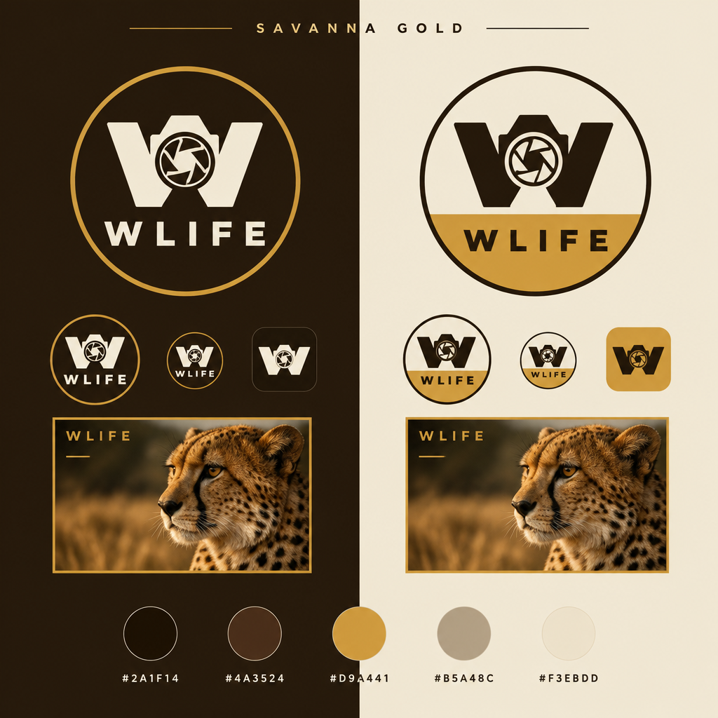
Symbol above WLIFE inside the round avatar with a gold ring. Compared with five other arrangements and genuinely downscaled.
System sheets (earlier palette)
Structure references rendered before the palette switch: still valid for layout, not for colour.